Basics of Color in Interface Design (UI) (or) A good color mastery in Interface Design (UI) is crucial. It can improve usability and help influence a user’s perceptions, like strengthening brand recognition and generating more conversion.
Painting, printing, photography, graphic design, and interface design use color theory to evoke specific ideas and concepts, taking advantage of the non-verbal capacity of color instead of other slower forms of communication.
In interface design, color psychology is used to influence the perceptions a user may have, from reinforcing brand recognition to generating more clicks on the purchase button. Other significant results, such as improved usability, can also be the result of good color mastery.
Harmony

Color is one of the most powerful tools in a designer’s arsenal. Finding a killer color combination can create harmony and level up the overall experience considerably.
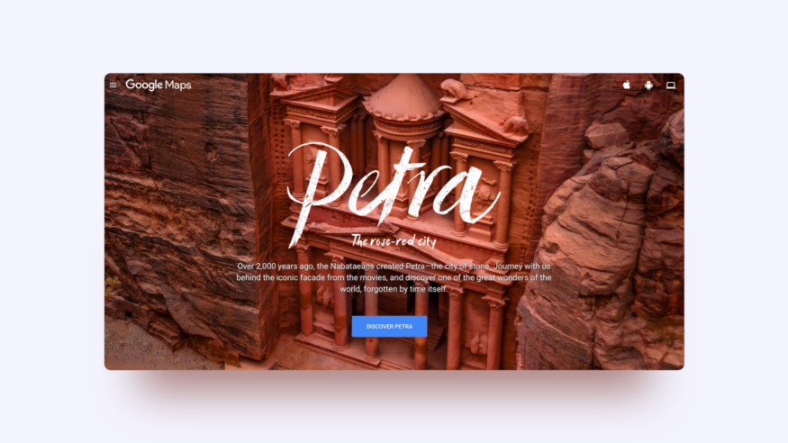
Why are analogous colors attractive? Because this is color behavior that comes from nature. The sunset displeases the sky from orange to purple, the sea can change from blue to turquoise, the rainbow includes all seven colors in a harmonious transition. We can conclude then that sight finds a natural delight in analogous colors.
It is advisable to maintain this color range only between warm or cold since the temperature also generates a considerable harmony. It is also possible to play with the saturation and brightness in these colors to create depth in analogs. It all depends on the effect you want to make and the content that the interface displays.
Contrast

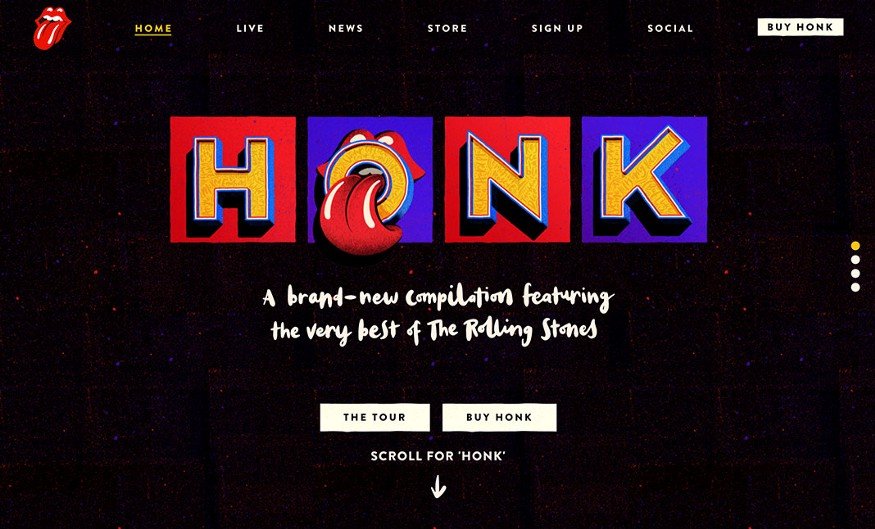
Color contrast gives dynamism to the interface. You can create high contrast by using complementary colors. These are colors that face each other in the color wheel.
Among the benefits of contrasting colors, there is the effect of energy and movement that can be given to the interface, as well as the intensification of some relevant point to which we want the user to pay attention. It is not easy to create harmony with these colors as their misuse could create visual chaos and be unpleasant to the eye. Proportion is the key.
To know more about color contrast, I recommend the book by the Swiss Johannes Itten, The Art of Color, where he exposes the theory of the seven types of contrast: hue, temperature, light-dark, complementary, saturation, simultaneous and quantitative. Whatever type of color contrast we choose, it should be maintained throughout the web/app pages for design consistency.
Interaction

The characteristics of interaction elements, for instance, the color, must be used consistently throughout the interface. For example, calls to action need enough contrast so that the user can identify them quickly.
However, the interaction color is not always characterized by being the most saturated or brightest, but rather by being the one that stands out from the other elements on the screen, either by its tone, shape, size, or contrast. Therefore, the effectiveness of an interaction color will be measured by the speed with which the user identifies the interaction areas and executes a task with less thought.
On the other hand, secondary calls to action weigh less and coexist visually closer to the information elements. In our example of the Nike application, the configuration and sound buttons indicate that these are interactions due to the shape but not to the color. This hierarchy of buttons is vital so that the user can give a natural order to the elements and avoid the bad practice of having more than one primary call to action per screen.
You can also take a look at my recent blog Basics of Hierarchy in Interface Design (UI) – Here are six fundamental properties.